 then Add to Home Screen.
Image Styles
The following outlines the image sizes used on the site. We highly recommend that you choose images at least the recommended sizes, as they are chosen for optimal display. Images larger than the recommended size are perfectly acceptable.
The sizes we recommend are the largest image size needed for that particular image field, from there, images will be scaled and cropped to their appropriate size for each breakpoint in accordance to the design.
All images should be 72 dpi, any higher could affect page load time.
Image Sizes (in px):
- Homepage banner image: 2000 x 600
- Banner and Featured Event image: 2000 x 800
- Anchor link: 600 × 350
- Legislation bills, Legislation pages, and Articles cover image: 1000 × 400
- Basic page cover image: 950 × 300
- Call to Action block - banner section: 375 x 200
- Call to Action block - body section: 370×440
- Speaker Images on Event Blocks: no wider than 175
- Person Content-Type/Bio Images: no smaller than 500x500
Photoshopping Images
Step 1: Open the image and go to the top menu Image then Image Size.
Step 2: Change the drop-down next to width or height to Pixels. If the with is less than 1000 px or the Image is too small and another image must be found.
Step 3: Click on the box next to Resample so that it is unchecked. A linked line should appear connecting to width, height, and resolution. Change the resolution to 72 Pixels/Inch.
Step 4: Uncheck the Resample box so only width and height are connected by the linked line and change the drop-down next to the width or height to Pixels. Change the width to 1000px and the height will automatically adjust to a size proportional. DO NOT change the height. Click Ok.
Step 5: Click on the crop tool and in the sizing guides at the top of the screen, the drop-down should say Ratio. Then in the box to the right of the drop-down type 1000 in the first and 400 in the second box. The grid should appear over the image. Make sure that the image is cropped so that it does not cut off anything that makes the subject matter complete. Click the check mark at the top of the screen to crop the image.
This is best practice as large image files will fill available space on our website and cause our site to run slowly. If an image is above 1MB it is too large.
Naming Images
When uploading images it is important to name the images with generic information about what is happening in the image so that the website can be accessible for those who are unable to see the image and must read the hover details instead. It also makes searching for images on the back end easier for staff.
Ex. Air Guardsman helping man in flood
Image Captions
Caption Title: ALL CAPS AND BOLD
Caption: No style applied
Headers
h1. This is a very large header.
h2. This is a large header.
h3. This is a medium header.
h4. This is a moderate header.
h5. This is a small header.
h6. This is a tiny header.
*Note: Any headlines that are textually linked, change to blue despite size or original color. Keep this in mind when linking headers.
Paragraphs/Links
Lorem ipsum dolor sit amet, consectetur adipiscing elit. Phasellus mollis sit amet nulla in vehicula. Donec facilisis velit lacus, sit amet lobortis lectus iaculis sit amet. Aenean ac bibendum odio. Proin elementum ligula et nulla imperdiet blandit non nec augue. Ut laoreet volutpat eros et tristique.
Lorem ipsum dolor sit amet, consectetur adipiscing elit. Phasellus mollis sit amet nulla in vehicula. Donec facilisis velit lacus, sit amet lobortis lectus iaculis sit amet. Aenean ac bibendum odio. Proin elementum ligula et nulla imperdiet blandit non nec augue. Ut laoreet volutpat eros et tristique.
Lorem ipsum dolor sit amet, consectetur adipiscing elit. Phasellus mollis sit amet nulla in vehicula. Donec facilisis velit lacus, sit amet lobortis lectus iaculis sit amet. Aenean ac bibendum odio. Proin elementum ligula et nulla imperdiet blandit non nec augue. Ut laoreet volutpat eros et tristique.
Lorem ipsum dolor sit amet, consectetur adipiscing elit. Phasellus mollis sit amet nulla in vehicula. Donec facilisis velit lacus, sit amet lobortis lectus iaculis sit amet. Aenean ac bibendum odio. Proin elementum ligula et nulla imperdiet blandit non nec augue. Ut laoreet volutpat eros et tristique.
If pulling copy from a document, the text needs to be stripped of all styles by being placed into a program such as Notebook before being pasted into the website.
*NGAUS follows the MLA Handbook for all website grammar.
Lists
- List item with a much longer description or more content.
- List item
- List item
- Nested list item
- Nested list item
- Nested list item
- List item
- List item
- List item
- List item with a much longer description or more content.
- List item
- List item
- Nested List Item
- Nested List Item
- Nested List Item
- List item
- List item
- List item
- List item with a much longer description or more content.
- List item
- List item
- Nested List Item
- Nested List Item
- Nested List Item
- List item
- List item
- List item
Blockquotes
Those people who think they know everything are a great annoyance to those of us who do.Isaac Asimov
Quote: Normal Paragraph Format
Quote Credit: H6. Heading style and Italic
Buttons
White background
Dark background
Alerts
Tables
Table - Standard
| Table Header | Table Header | Header | Header |
|---|---|---|---|
| Content Goes Here | This is longer content Donec id elit non mi porta gravida at eget metus. | Content Goes Here | Content Goes Here |
| Content Goes Here | This is longer Content Goes Here Donec id elit non mi porta gravida at eget metus. | Content Goes Here | Content Goes Here |
| Content Goes Here | This is longer Content Goes Here Donec id elit non mi porta gravida at eget metus. | Content Goes Here | Content Goes Here |
Table - Secondary
| Table Header | Table Header | Header | Header |
|---|---|---|---|
| Content Goes Here | This is longer content Donec id elit non mi porta gravida at eget metus. | Content Goes Here | Content Goes Here |
| Content Goes Here | This is longer Content Goes Here Donec id elit non mi porta gravida at eget metus. | Content Goes Here | Content Goes Here |
| Content Goes Here | This is longer Content Goes Here Donec id elit non mi porta gravida at eget metus. | Content Goes Here | Content Goes Here |
Embedding Youtube Videos
Add the <div> class to any video embedding code by doing the following:
Step 1: Click the Source button in the body
Step 2: Locate where you would like the video to go. This can be tricky because the website code can be hard to navigate.
Step 3: Add <div class="responsive-embed"> before the first <iframe> tag. Then add </div> after the second <iframe> tag.
Example:
<div class=”responsive-embed”>
<iframe youtube embeded code></iframe>
</div>
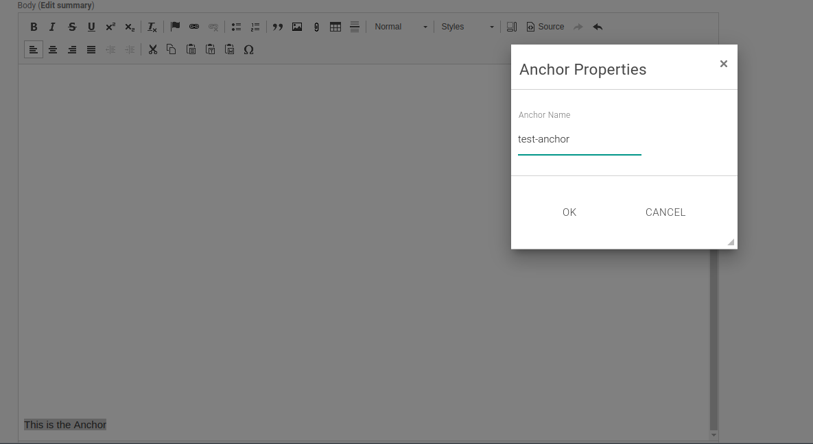
Anchor Tags
Here is how the anchor link module works: https://ngaus.utstaging.com/anchor-link-example
- Highlight the text you want to anchor to (example, first word in the last paragraph)
- Click the anchor link flag
- In the box, add an anchor link name (with no spaces, you can use dashes though)
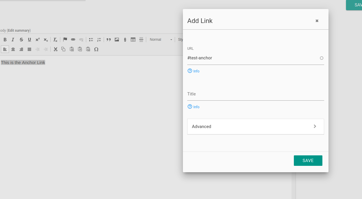
- Highlight the text that you want to act as the link (Sentance in the first paragraph)
- Click the link button, and in the url add #your-anchor-name. Make sure to add the # before whatever you named your anchor.
Paragraph Examples
Lorem ipsum dolor sit amet, commodo in adipiscing nulla, nam ipsum a sunt sed quis quam, blandit sit vel in. In sed donec fugit, purus in vivamus amet dolor, volutpat non. Arcu dui auctor diam, ullamcorper amet neque varius, praesent maecenas. Erat elit pede neque, sed wisi nulla dolor pellentesque nec, penatibus ut a mollis. Nulla elit ipsum velit, erat sed vel platea morbi, viverra vestibulum elit. Erat quis, arcu vestibulum lacus vestibulum interdum, tellus leo consectetuer volutpat erat ligula rutrum. Nunc et, sociosqu fringilla fusce et. Nibh vitae nisl. Semper aliquam pretium in eros, et in ac, a sollicitudin vulputate libero dui. Interdum amet sed ultricies in, tortor amet vel ac in. Nibh massa, etiam vel reprehenderit malesuada arcu ut facilisis, sed ornare suspendisse pellentesque integer congue, aliquet vivamus quis integer a metus leo, optio scelerisque libero vestibulum erat integer arcu.
Lorem ipsum dolor sit amet, commodo in adipiscing nulla, nam ipsum a sunt sed quis quam, blandit sit vel in. In sed donec fugit, purus in vivamus amet dolor, volutpat non. Arcu dui auctor diam, ullamcorper amet neque varius, praesent maecenas. Erat elit pede neque, sed wisi nulla dolor pellentesque nec, penatibus ut a mollis. Nulla elit ipsum velit, erat sed vel platea morbi, viverra vestibulum elit. Erat quis, arcu vestibulum lacus vestibulum interdum, tellus leo consectetuer volutpat erat ligula rutrum. Nunc et, sociosqu fringilla fusce et. Nibh vitae nisl. Semper aliquam pretium in eros, et in ac, a sollicitudin vulputate libero dui. Interdum amet sed ultricies in, tortor amet vel ac in. Nibh massa, etiam vel reprehenderit malesuada arcu ut facilisis, sed ornare suspendisse pellentesque integer congue, aliquet vivamus quis integer a metus leo, optio scelerisque libero vestibulum erat integer arcu.